DGL
https://delphigl.com/forum/

Anti-aliased Bitmap Fonts in Orthographic Projection.
https://delphigl.com/forum/viewtopic.php?f=19&t=6782
Seite 1 von 1

Autor:  dpm_dpmartin [ Fr Jul 27, 2007 12:33 ]
Betreff des Beitrags:  Anti-aliased Bitmap Fonts in Orthographic Projection.

I am creating myself a simple menu'ing system in OpenGL. This is what it looks like at the moment, not very exciting - but, more importantly, it's not very pleasant looking as I have jagged edges on my bitmap font that I cannot seem to remove.

Bild

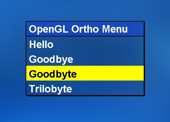
The above is a .jpg so it probably looks slightly better than it does on my screen. On my screen, the jaggies are very clear to me and I think it is unacceptable. I am creating my fonts with the following code - and you will see that I am using the ANTIALIASED_QUALITY flag. However, if I change this flag to NONANTIALIASED_QUALITY, PROOF or DRAFT everything still looks the same.

Code:
  1. CreateFont (-MulDiv (FontSizes[Loop],GetDeviceCaps (DC,LOGPIXELSY),72),0,0,0,FW_BOLD,0,0,0,ANSI_CHARSET,OUT_TT_PRECIS,CLIP_DEFAULT_PRECIS,ANTIALIASED_QUALITY,FF_DONTCARE or DEFAULT_PITCH,'Arial');

In my OpenGL initialisation, I am setting glShadeModel (GL_SMOOTH); and glHint (GL_PERSPECTIVE_CORRECTION_HINT,GL_NICEST); - and in my drawing routine, I am using blending - when I do the menu I am using glBlendFunc (GL_SRC_ALPHA,GL_ONE);. Whatever I have done up to this point in code - I can't seem to set anti-aliased bitmap fonts... when I went into my Display settings, then the Advanced button, then the OpenGL tab I saw a setting for global anti-aliasing - when I altered those settings I got some very strange effects (the size of everything changed) but I did see some anti-aliasing on the font as the graphics card seems to have taken complete responsibility.

I don't want to use that though - it looked terrible still. I think that my question really comes down to... how can I be sure that I am going to be using anti-aliased bitmap fonts in code? What do I need to do?

Autor:  Lossy eX [ Fr Jul 27, 2007 14:14 ]
Betreff des Beitrags: 

Bitmap fonts in OpenGL are really BITmaps fonts. You only can have 0 or 1 for each pixel. They don't care about the quality of the given font.

I have released the first developerversion of my font project. Just take an look. ;)

Yes i know the site in german. So i will explain it an bit. Its an opengl like library for texture fonts with provides some easy to use output functions. To use it you must perform the following steps.
- Initialize external libraries.
- Create and Bind an Context.
- Setup an renderer and creator.
- Then you can create any fonts (tsFontCreateCreator) you want.
Needed source you can find in the post and in the samples. The samples should explain the rest. Source of the project you also can find in the post. Just download the two windows ZIP or 7z (same content but other format).

For the first right release i'll make an english help with samples and images inline.

PS: To create fonts with the facename you need the setup the creator TS_CREATOR_GDI_FACENAME. And the parameter "name" of tsFontCreateCreator means the facename. I dosn't have any sample for this.

Autor:  dpm_dpmartin [ Fr Jul 27, 2007 16:55 ]
Betreff des Beitrags: 

Damn! That's annoying - I had really hoped there would be a way to make my fonts look better.

So... this really brings up two new questions...

1) If I am using ANTIALIASED_QUALITY in my CreateFont call now, would using DRAFT be quicker, or use less RAM? As we've already decided the quality doesn't seem to improve or degrade.

2) If I can't have anti-aliased 2D fonts easily - is there a good way of creating an ouline 1 pixel wide on my font?

I usually would have done 2) by just writing the same text four times offset slighly to the left, top, bottom and right in black - making sure that there was an outline border of 1 pixel - that doesn't sound very clever though.

Fonts! Who would have thought they could be so frustrating!

Autor:  dpm_dpmartin [ Fr Jul 27, 2007 17:12 ]
Betreff des Beitrags: 

I implemented it, to just see what it would look like... which looks best?

Drop-shadow:
Bild

Outline:
Bild

The correct answer can be "neither looks best" of course.

Performance doesn't seem to be affected by doing my horrible outline algorithm.

Autor:  i0n0s [ Fr Jul 27, 2007 19:20 ]
Betreff des Beitrags: 

Drop-shadows looking better ;)

Seite 1 von 1 Alle Zeiten sind UTC + 1 Stunde
Powered by phpBB® Forum Software © phpBB Group
https://www.phpbb.com/